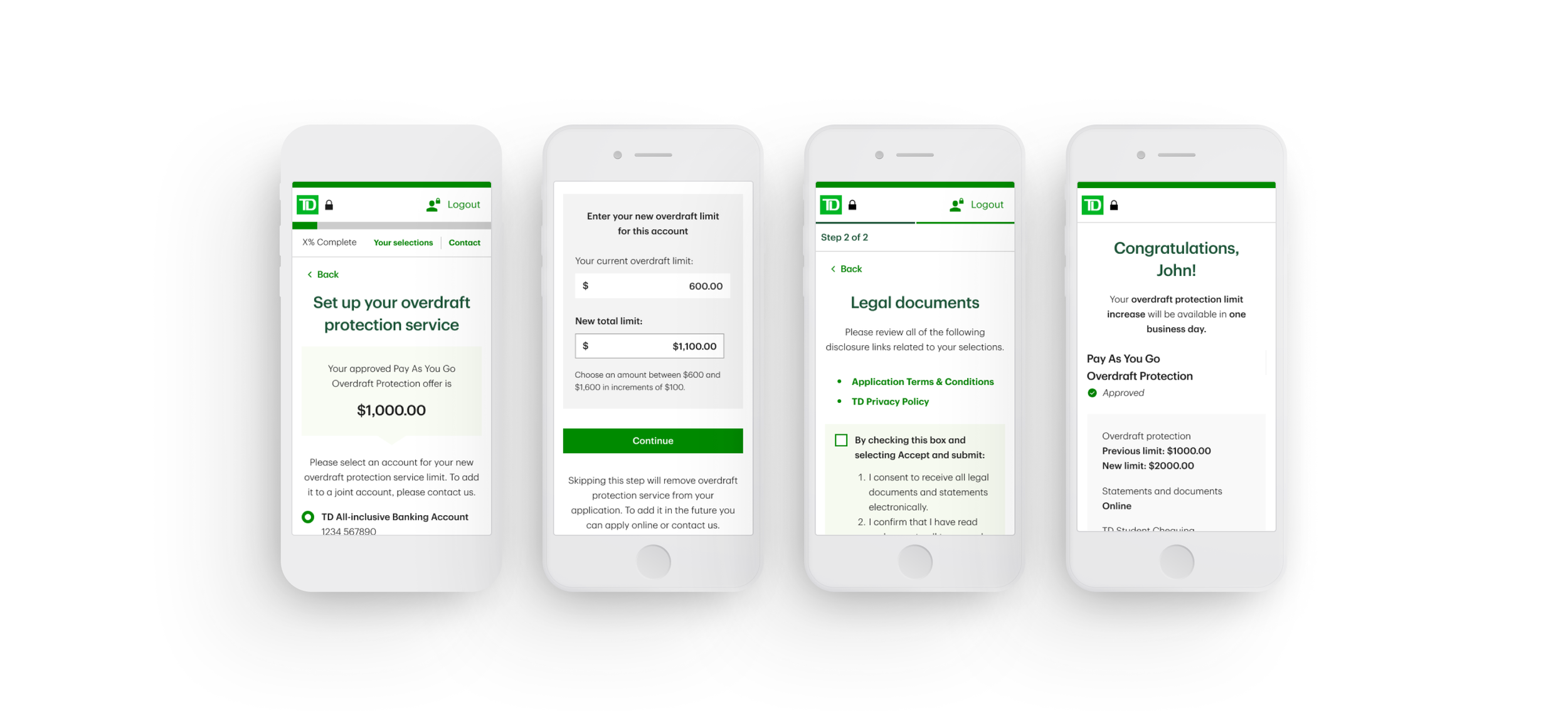
Enabling Confident Overdraft Protection Limit Decision
Allowing customers to
set pre-approved credit,
up to a defined limit
Role:
UX/UI Designer
Industry:
Banking
Timeline:
Sep - Dec 2025
Client:
TD Bank
Overview
In recent years, TD Bank has expanded many of its banking experiences to mobile, allowing customers to manage key financial decisions directly from their phones.
Credit-related flows are especially critical in this context, as they require clarity and trust. Although customers were eligible for overdraft protection, many were not completing the digital flow to select or adjust their limit. This project focused on redesigning that experience to reduce friction, improve clarity, and support confident decision-making in a sensitive financial moment.
Team:
1 Design Manager
3 UX/ Designers
1 UX Writter
Tools:
Figma
FigJam
Confluence
Outcomes
↑ flow completion
clear decision path
simplified limit selection
↓ cognitive load
clarity in sensitive financial information
↓ branch
dependency
fewer users needing in-person support
↑ user confidence
Challenge
Existing screen and flow for selecting an overdraft limit were cognitively confusing
Users struggled to understand what amount they were choosing.
This resulted in:
Drop-offs during the flow
Underutilization of pre-approved credit
Users abandoning digital channels and going to physical branches or calling to the TD Line
The challenge affected both users and the business:Users experienced friction, uncertainty, and errors in a high-stakes financial decision
The business faced low digital adoption and increased operational load
If not addressed, the experience would continue to generate abandonment, dissatisfaction, and a broken digital journey.
Before (BAU Screen)
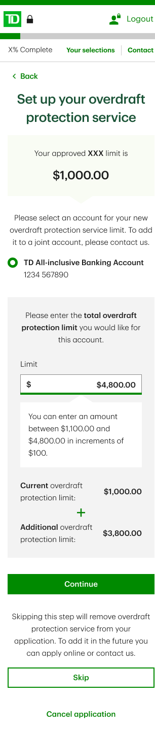
Why it didn’t work
1. The hierarchy didn’t reflect the mathematical relationship
The total overdraft protection limit was presented as the primary value, without being visually expressed as the result of a sum. Its components current and additional limits appeared later and with less visual weight, breaking the natural parts → total mental model.
2. The sum was conceptually correct, but visually invisible
Although the experience relied on an additive logic (current + additional = total), this relationship was not represented in the layout. Users had to infer the operation instead of seeing it through structure and hierarchy.
3. Inverted information hierarchy
By showing the total before its breakdown, the screen forced users to work backwards to understand their choice, increasing cognitive effort and slowing comprehension.
How I contributed
Owned the problem from definition to delivery. My contributions included:
- Reframing the original problem statement beyond the initial request
- Leading a definition workshop to align teams on goals and constraints
- Consolidating requirements from multiple business teams touching the same flow
- Conducting competitive analysis to understand industry patterns
- Exploring and designing multiple UI approaches
- Presenting design rationale and recommendations to stakeholders
- Running accessibility reviews in collaboration with specialists
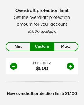
Increment Selector
Met business expectations by guiding the selection, but introduced accessibility and precision limitations.
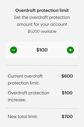
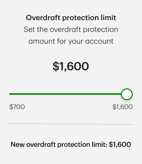
Slider
Well received by business stakeholders and visually intuitive, yet risky for accessibility and accurate input
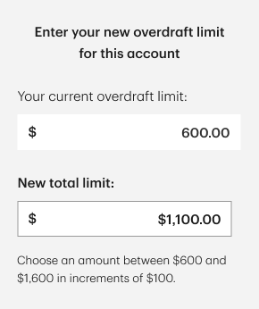
Input Field (Selected Option)
Less visually expressive, but provided the highest level of clarity, precision, and accessibility, particularly for screen readers.
Designing Shared Understanding
Two business teams had opposing views on how users should select their overdraft limit: one wanted to restrict manual input, while the other believed it was necessary.
I reframed the discussion away from preference and toward risk, focusing on cognitive load, accessibility, and error prevention. By grounding the conversation in UX research, accessibility standards, and usability risks, I helped align stakeholders around a decision based on user safety and clarity rather than visual appeal.
Shaping product experience
The core design challenge was enabling users to choose a credit limit with confidence.
I explored multiple interaction patterns:
sliders
increment buttons
direct input
and evaluated each against usability, accessibility, and financial risk considerations. The final direction balanced business constraints with user needs, supported by clear rationale and documented trade-offs.
Key Takeaways
This project reinforced several key learnings for me:
I gained exposure to banking credit mechanics that do not exist in my home country
I deepened my understanding of how critical usability and accessibility are in financial products used by a broad population
I experienced firsthand how research, standards, and accessibility expertise can strengthen design decisions and de-risk products
I was reminded that part of a designer’s role is not just designing screens, but guiding teams toward better decisions