
Designing Digital
Identity Verification
Integrating digital identity verification into a mobile banking account opening experience
Role:
UX/UI Designer
Industry:
Banking
Timeline:
Mar - Aug 2025
Client:
TD Bank
Overview
TD Bank is one of North America’s leading financial institutions, serving millions of customers across Canada and the United States through digital and physical banking channels.
This project introduced DVS (Digital Verification Service), a fully digital identity verification process that allows users to verify their identity remotely using an official
ID and their mobile phone
Team:
1 Design Manager
3 UX/ Designers
1 UX Writter
Tools:
Figma
FigJam
Confluence
Outcomes (MVP1 Projected)
digital attrition
(early reduction
in drop-offs)
~50%
active-on-day-one accounts (up from ~35%)
<30%
frozen accounts
(fewer cases requiring in-branch support)
~14%
conversion rate
↓50%
Challenge
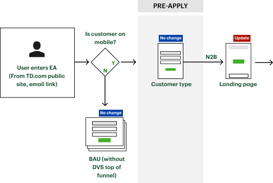
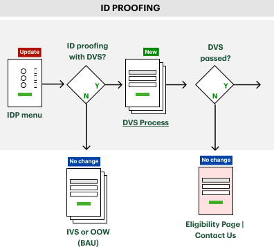
Introducing digital identity verification required more than adding a new step to the flow.
Key questions needed to be resolved:
Where identity verification should live within the journey
How to differentiate verification options clearly
How to handle freezes, hard stops, and fraud-related outcomes
How to align multiple teams under legal and time constraints
How I contributed
Facilitated How Might We workshops to frame the problem space
Explored alternative product flows and verification entry points
Defined decision points, stop scenarios, and recovery paths
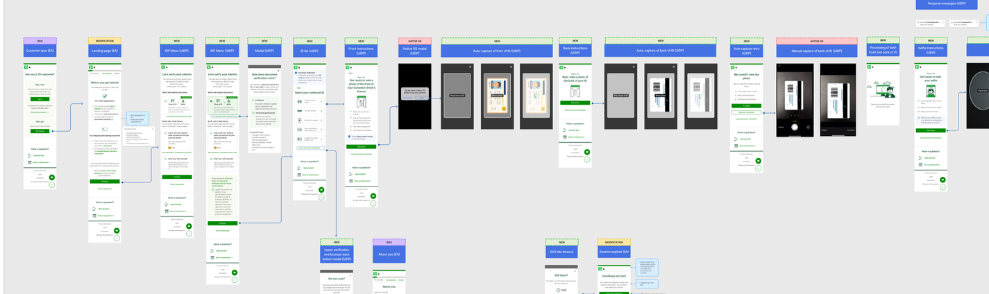
Designed end-to-end flows and wireframes
Partnered with research to define and observe remote usability testing
Designing Shared Understanding
Workshops, research insights, and testing learnings helped align teams around:
Non-negotiable legal and fraud constraints
User expectations and mental models
Opportunities to simplify and prioritize mobile-first verification
This alignment reduced ambiguity and enabled faster design decisions.
Shaping product experience
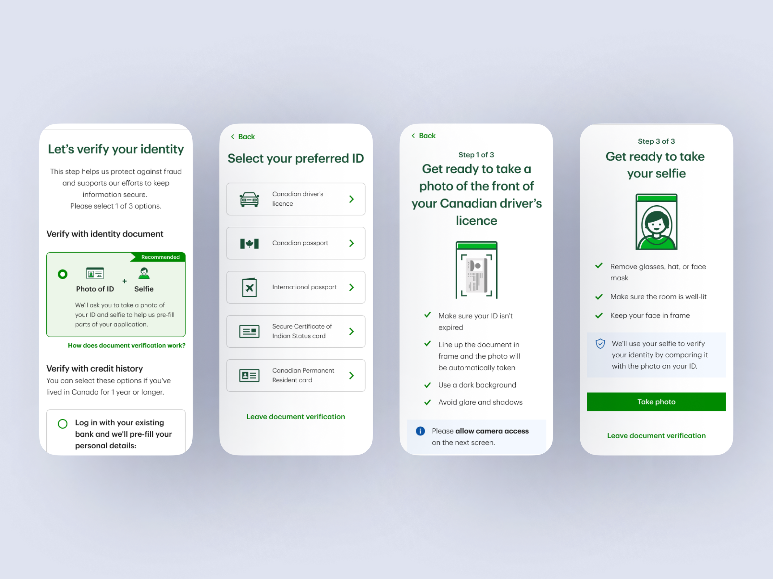
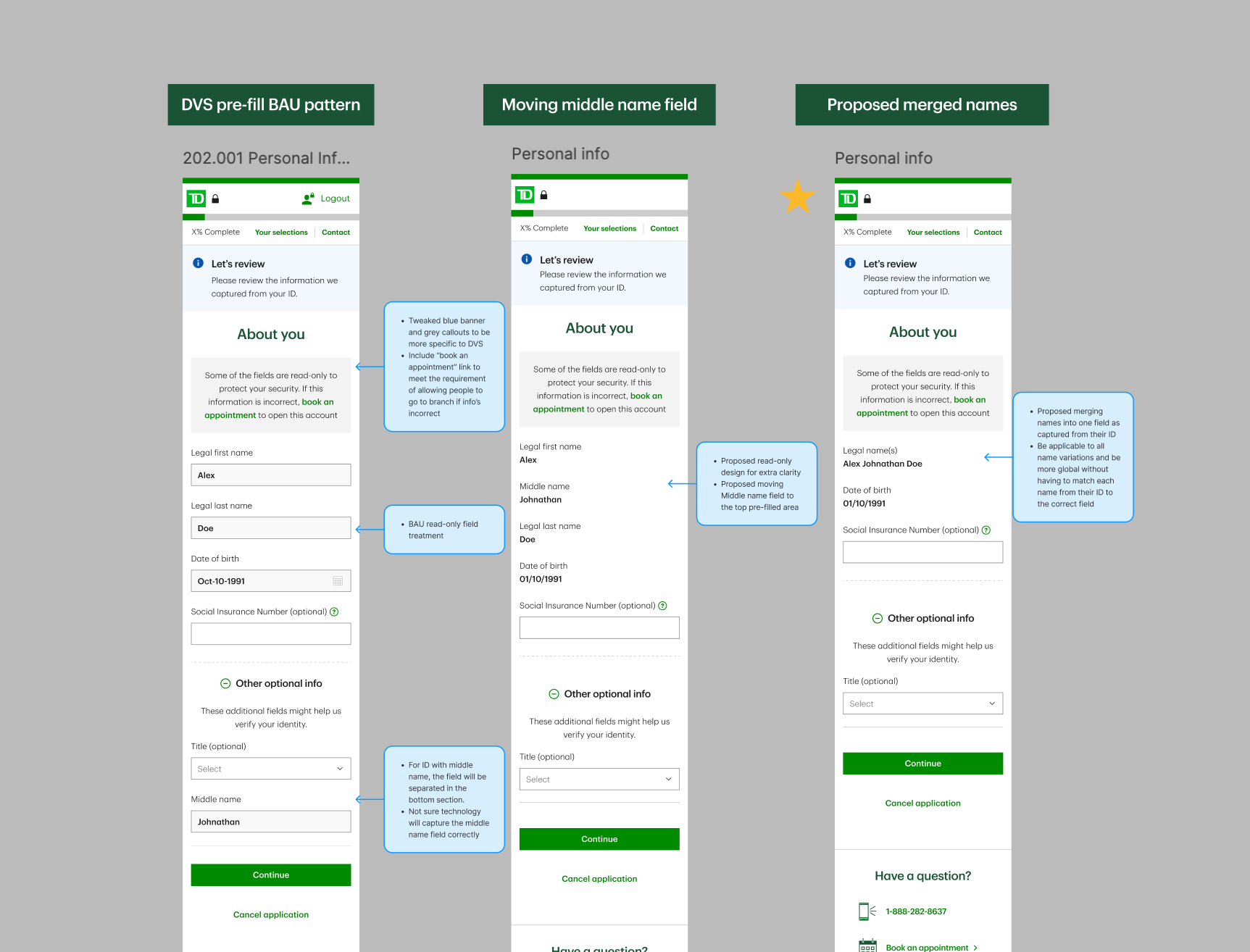
The final experience introduced DVS as a third verification option allowing users to:
Upload an ID
Take a selfie
Automatically pre-fill personal information
This reduced friction, shortened the process, and supported users who preferred not to link external accounts or manually enter data
Key Takeaways
One key learning from this project was how much clarity matters in complex systems. When constraints are heavy, design becomes less about perfect solutions and more about helping teams see options, trade-offs, and next steps clearly. Spending time aligning early made the rest of the work easier to move forward.
Timing also hit different here. Usability testing happened after designs were already handed off to development, which left little room to act on what we learned before launch. Running tests earlier even quick and scrappy ones would have cut down on risk and made our decisions feel a lot more grounded.
In regulated environments, bringing legal in early just makes sense. Sharing context upfront avoids friction down the line and makes the whole collaboration less of a negotiation and more of an actual partnership.
On a personal level, this project reminded me that asking direct questions, pushing back on established patterns, and calling out misalignments early is always worth it. Good collaboration didn't live in the big checkpoints it lived in the ongoing, back-and-forth conversations that kept things moving and everyone pointed in the same direction.